[Web] SNS형 게시판 만들기 프로젝트 (3) - CSS 설정

지난 시간에는 큰 틀을 잡았습니다.
이번에는 단순 table로만 설정한 틀을 고치기위해서 CSS를 잡아줍시다.
테이블로 잡으면 코드를 보기가 너무 안좋습니다.
이번에는 section, aside 등을 활용하고 CSS로 디자인을 잡아줍시다.
오늘 핵심이 되는 것은 CSS의 활용과 페이지의 구획분활입니다.
HTML5에는 마치 table과 div으로 나눠놓은 것처럼 구획이 나눠져 있습니다.
보통 아래와 같이 구분을 하게 됩니다.

header는 웹에서 가장 맨 위부분을 차지하게 됩니다.
보통 웹의 정보를 담고 있는 부분입니다.
nav는 navigation에서 파생된 것으로 특정 목적지로 이동할 수 있게 링크들을 모아둔 영역입니다.
보통 해당 웹페이지의 카테고리 영역이 위치하게 됩니다.
section은 핵심적인 내용을 담는 부분입니다. 보통 독립적으로 유지되게 됩니다.
그래서 여러 태그를 사용가능합니다. 마치 body안에 있는 작은 body 느낌입니다.
section에는 article이라는 요소를 사용해서 본문을 기록할 수 있습니다.
aside는 보통 사이드바라고 불리는 광고영역을 다루게 됩니다.
본문과 상관성은 있지만 직접적인 연관은 없는 걸 보통 기록합니다.
footer는 일반적으로 바닥영역입니다.
계속 보여질 필요없이 페이지 가장 하단에만 보여지면 되는 정보들을 기록합니다.
보통 저작권, 연락처등이 있습니다.
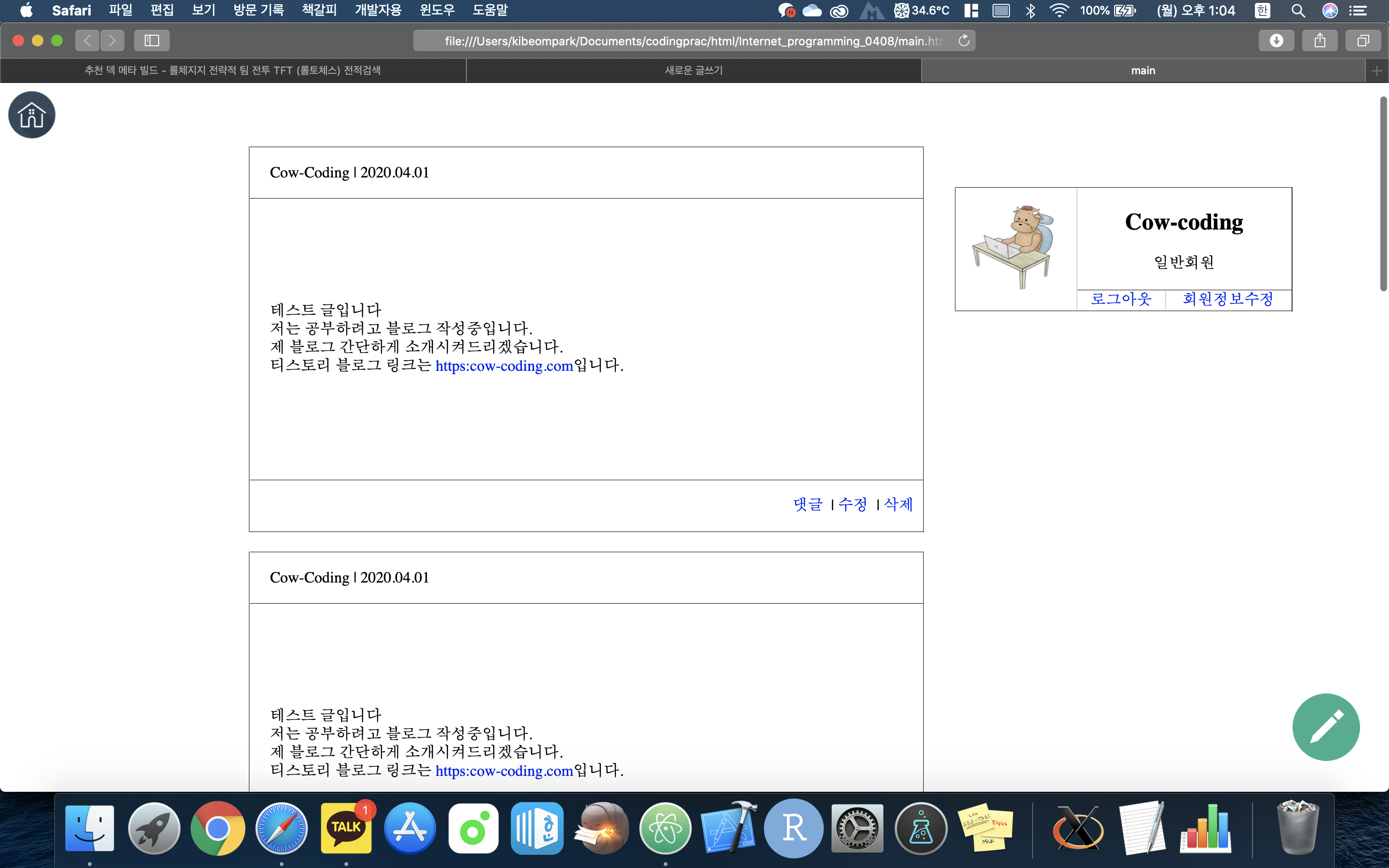
지난 번에 제작한 main.html입니다. 지난 번에는 table로 잡아줬는데요.
이번에는 홈 버튼은 header로, profile은 aside로, 글이 출력되는 박스는 section으로 잡아줍시다.
<!DOCTYPE html>
<html>
<head>
<meta charset="UTF-8">
<title>main</title>
<style>
</style>
</head>
<body>
<!--home button-->
<header class="home">
<a href="#"><img src="image/Home.png"></a>
</header>
<!--profile aside-->
<aside class="profile">
<table border="1" style="border-collapse:collapse;">
<tr>
<td rowspan="2"><img src="image/profile.jpeg"></td>
<td colspan="2">
<h2 style="text-align:center">Cow-coding</h2>
<p style="text-align:center">일반회원</p>
</td>
</tr>
<tr>
<td>
<a href="start.html"> 로그아웃 </a>
</td>
<td>
<a href="edit.html"> 회원정보수정 </a>
</td>
</tr>
</table>
</aside>
</body>
</html>
우선 홈버튼 부분은 header 잡아줍니다.
정확한 위치는 CSS에서 position을 활용해서 잡아주면 됩니다.
이러서 aside로 프로필의 위치를 잡아줍니다.
aside 내부에 프로필이 나오는 부분은 크게 복잡하지 않고 많은 수정을 필요하지 않으니 그냥 테이블로 잡아줬습니다.
이제 section 파트를 작성해보겠습니다.
<!DOCTYPE html>
<html>
<head>
<meta charset="UTF-8">
<title>main</title>
<style>
</style>
</head>
<body>
<!--home button-->
<header class="home">
<a href="#"><img src="image/Home.png"></a>
</header>
<!--profile aside-->
<aside class="profile">
<table border="1" style="border-collapse:collapse;">
<tr>
<td rowspan="2"><img src="image/profile.jpeg"></td>
<td colspan="2">
<h2 style="text-align:center">Cow-coding</h2>
<p style="text-align:center">일반회원</p>
</td>
</tr>
<tr>
<td>
<a href="start.html"> 로그아웃 </a>
</td>
<td>
<a href="edit.html"> 회원정보수정 </a>
</td>
</tr>
</table>
</aside>
<!--// 추가된 코드 영역 //-->
<!--text section-->
<section class="main_text">
<table border="1">
<tr>
<td class="profile_td">
<p class="info">Cow-Coding | 2020.04.01 </p>
</td>
</tr>
<tr>
<td>
<div class="text_output">
테스트 글입니다<br>
저는 공부하려고 블로그 작성중입니다.<br>
제 블로그 간단하게 소개시켜드리겠습니다.<br>
티스토리 블로그 링크는 <a href="https:cow-coding.tistory.com">https:cow-coding.com</a>입니다.<br>
</div>
</td>
</tr>
<tr>
<td class="profile_td">
<p style="text-align:right;">
<a href="#">댓글</a> |
<a href="#">수정</a> |
<a href="#">삭제</a>
</p>
</td>
</tr>
</table>
</section>
<!--// 추가된 코드 영역 //-->
</body>
</html>
article 요소를 활용해서 본문을 작성해도 괜찮지만 이번에는 그냥 table로 작성하겠습니다.
최종 제출할 때는 article 요소로 변경할 예정입니다.
table의 border는 모두들 보이게 할 예정이고 border-collapse는 CSS로 따로 collapse로 일치시킬 겁니다.
이제 페이지 우하단부의 글쓰기 영역 버튼을 구현해봅시다.
이 부분은 사실 footer로 하려고 했는데 그렇게 되면 위에서 말했듯이 페이지 최하단부로 이동해야합니다.
그러나 제가 원하는 것은 profile 영역과 글쓰기 버튼, 홈버튼과는 독립적으로 글 출력부분만 페이지 스크롤이 적용되게 할 예정입니다.
글쓰기 버튼은 profile영역인 aside에 위치시켜주고 자리만 잡아줍시다.
<!DOCTYPE html>
<html>
<head>
<meta charset="UTF-8">
<title>main</title>
<style>
</style>
</head>
<body>
<!--home button-->
<header class="home">
<a href="#"><img src="image/Home.png"></a>
</header>
<!--profile aside-->
<aside class="profile">
<table border="1" style="border-collapse:collapse;">
<tr>
<td rowspan="2"><img src="image/profile.jpeg"></td>
<td colspan="2">
<h2 style="text-align:center">Cow-coding</h2>
<p style="text-align:center">일반회원</p>
</td>
</tr>
<tr>
<td>
<a href="start.html"> 로그아웃 </a>
</td>
<td>
<a href="edit.html"> 회원정보수정 </a>
</td>
</tr>
</table>
<!--// 추가된 코드 영역 //-->
<div class="write">
<a href="write.html"><img src="image/write.png" onmouseover='this.src="image/write_over.png"' onmouseout='this.src="image/write.png"'></a>
</div>
<!--// 추가된 코드 영역 //-->
</aside>
<!--text section-->
<section class="main_text">
<table border="1">
<tr>
<td class="profile_td">
<p class="info">Cow-Coding | 2020.04.01 </p>
</td>
</tr>
<tr>
<td>
<div class="text_output">
테스트 글입니다<br>
저는 공부하려고 블로그 작성중입니다.<br>
제 블로그 간단하게 소개시켜드리겠습니다.<br>
티스토리 블로그 링크는 <a href="https:cow-coding.tistory.com">https:cow-coding.com</a>입니다.<br>
</div>
</td>
</tr>
<tr>
<td class="profile_td">
<p style="text-align:right;">
<a href="#">댓글</a> |
<a href="#">수정</a> |
<a href="#">삭제</a>
</p>
</td>
</tr>
</table>
</section>
</body>
</html>
전체적인 페이지 디자인이 밋밋하다보니 글을 작성하기 위해서 마우스를 올릴 때 디자인을 바꿔주겠습니다.
img 태그 기능을 onmouseover과 onmouseout을 활용해주면 됩니다.
<img src="원본 사진경로" onmouseover='"마우스를 올렸을 때 사진경로"' onmouseout='"마우스를 뗐을때 사진경로"'>
이제 대충 틀을 잡고 파일들을 위치해줬으니 CSS로 작업을 진행해줍시다.
우선, 미관적인 걸 위해서 모든 a태그의 밑줄은 지워줍시다.
<style>
a {
      text-decoration: none;
   }
</style>
그리고 제가 원하는 작업을 해야합니다.
aside부분이 스크롤 해도 항상 같은 위치에 있게 고정시켜야합니다.
<style>
a {
      text-decoration: none;
   }

.profile {
      padding-top: 50px;
      text-align: center;
      position: fixed;
      float: right;
      right: 100px;
      display: table-cell;
   }

.profile table {
      width: 350px;
      height: 50px;
   }

.profile img {
      width: 100px;
      height: 100px;
   }
</style>
.profile과 같이 입력을 하면 class이름이 profile인 영역에 CSS를 적용시켜줍니다.
padding-top은 위쪽 내부 테두리 영역입니다. 미관적인 부분이에요.
제일 중요한 것은 position과 display-cell입니다. 그 외는 전체적인 미관부분이에요.
사실 display같은 경우는 talbe-cell 안 적어도 무관하긴 합니다. 원래 aside가 위치하는 곳이 있으니까요.
position은 fixed를 해주면 페이지가 어떻게 되든 항상 그 위치에 고정되게 됩니다.
기왕 aside영역 작업했으니 글쓰기 영역으로 넘어가는 버튼도 CSS작업을 진행해 줍시다.
<style>
a {
      text-decoration: none;
   }

.profile {
      padding-top: 50px;
      text-align: center;
      position: fixed;
      float: right;
      right: 100px;
      display: table-cell;
   }

.profile table {
      width: 350px;
      height: 50px;
   }

.profile img {
      width: 100px;
      height: 100px;
   }

.write {
      position: absolute;
      bottom: -470px;
      right: -70px;
   }

.write img {
      width: 70px;
      height: 70px;
   }
</style>
글쓰기 영역 이동 버튼 class명은 write입니다.
position을 absolute로 해주면 상위 태그를 기준으로 위치가 변동되게 됩니다.
write division의 상위태그는 aside입니다. 이렇게 하면 aside의 위치를 기준으로 잡히게 됩니다.
이제 본문 영역인 section을 미관적인 부분을 건드려줍시다.
글이 출력되는 본문영역을 최대한 넓히고, 댓글, 글쓴이 정보는 칸을 최대한 줄여줍시다.
<style>
a {
      text-decoration: none;
   }

.profile {
      padding-top: 50px;
      text-align: center;
      position: fixed;
      float: right;
      right: 100px;
      display: table-cell;
   }

.profile table {
      width: 350px;
      height: 50px;
   }

.profile img {
      width: 100px;
      height: 100px;
   }

.write {
      position: absolute;
      bottom: -470px;
      right: -70px;
   }

.write img {
      width: 70px;
      height: 70px;
   }

.profile_td {
      height: 20px;
   }

.info {
      padding-left: 20px;
      text-align: left;
   }
</style>
profile_td class는 글에서 작성자 정보랑, 댓글,수정,삭제가 출력되는 테이블 칸을 조절해줍니다.
info class는 작성자 정보가 출력되는 부분 디자인을 잡아줍니다.
원래 우측정렬 했는데 디자인이 별로라서 좌측정렬을 해줬습니다.
padding-left를 안잡아주면 테이블 border에 바짝 붙어버리기 때문에 미관상 예쁘지가 않습니다.
이제 전체 section의 디자인을 잡아줍시다.
<style>
a {
      text-decoration: none;
   }

.home {
      width: 100%;
      background-color: white;
      height: 50px;
      position: relative;
   }

.home img {
      width: 50px;
      height: auto;
      position: fixed;
   }

.profile {
      padding-top: 50px;
      text-align: center;
      position: fixed;
      float: right;
      right: 100px;
      display: table-cell;
   }

.profile table {
      width: 350px;
      height: 50px;
   }

.profile img {
      width: 100px;
      height: 100px;
   }

.write {
      position: absolute;
      bottom: -470px;
      right: -70px;
   }

.write img {
      width: 70px;
      height: 70px;
   }

.profile_td {
      height: 20px;
   }

.info {
      padding-left: 20px;
      text-align: left;
   }

.main_text {
      padding-top: 50px;
      position: relative;
      display: table-cell;
      left: 250px;
   }

.main_text table {
      width: 700px;
      height: 400px;
      border-collapse: collapse;
      margin-bottom: 20px;
   }
</style>
main_text class는 section의 클래스 이름입니다.
position을 relative로 해주면 원점, 즉 웹의 최 좌측상단을 기준으로 좌표가 잡힙니다.
그 외에는 적당히 디자인적으로 설정해줍시다.
이렇게 해주시면 모두 끝이 났습니다!
이번 글에서 핵심은 section, header와 같이 특정한 위치가 지정되는 태그를 걸어주는 것과
position CSS였습니다.
'Computer Science > Web' 카테고리의 다른 글
| [Web] SNS형 게시판 만들기 프로젝트 (4) - Java Script 사용 (0) | 2020.05.17 |
|---|---|
| [Web] HTML / CSS /JavaScript 내용 정리 (1) | 2020.05.03 |
| [Web] SNS형 게시판 만들기 프로젝트 (2) - 기본 레이아웃 (0) | 2020.04.10 |
| [Web] SNS형 게시판 만들기 프로젝트 (1) - 스토리보드 구성 (0) | 2020.04.09 |
| [Web] 아톰(Atom) 에디터 사용 플러그인 (0) | 2020.04.08 |